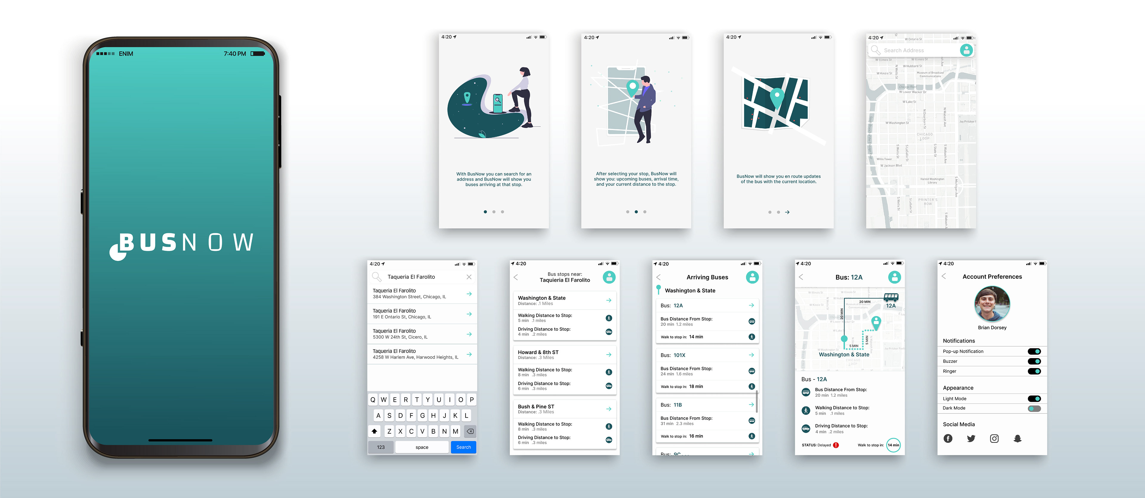
BusNow
Problem: Public buses in a city in the midwest occasionally operate out of service due to maintenance, traffic, and other issues. The transportation agency that runs the buses just installed public bus trackers and they need to figure out a way to get this information to the public. Riders need to know when the next bus will arrive at each stop and how much time they have to get there.
Solution: BusNow was created, a simple and intuitive app that tells users where their bus is and how much time they have to get to the stop.
Role: User Research, Prototyping, Wireframes, UI design, Branding
Tools: Figma, Google Forms, Adobe Illustrator, and FlowMapp
Competitive Analysis
Using the double-diamond design process for the problem solving of this app I started off in the discover phase and with this I completed a competitive analysis of three different transportations apps: Google maps, Transit, and CityMapper. This helped gain inspiration on what was done well on the app and what could be improved upon.

Transit
Strengths
Large and easily identifiable search box and good color contrast for the different bus schedules.
Weaknesses
Small font size is not accessible and difficult to get back to your current location after typing in an address.
Google Maps
Strengths
Great at separating addresses and splitting different types of public transportation with different icons.
Weaknesses
Recommended routes contain train, bus, and lyft options and are not split primarily in to just bus or train.
CityMapper
Strengths
Easily identifiable icons and minimal color palette.
Weaknesses
Too much cognitive load on home screen and displaying non-vital information like health information.
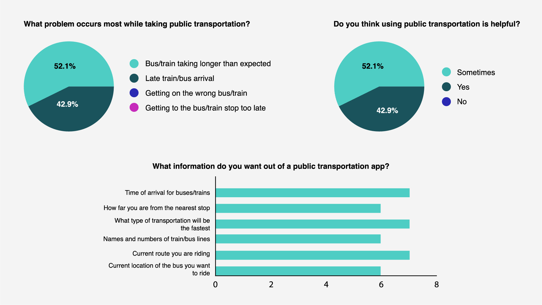
User Survey
I sent out a survey using Google Forms to public transportation riders in New York City and San Francisco to gain insight in users pain points and understand different perspectives. The most important information users want in an app is time of arrival for the bus and knowing the current route they are riding or what route they are about to ride. I was surprised to find that only 42% rated a public transportation app 7/10 in getting them to their location in a timely manner without frustrations. Two of the biggest problems riders face while taking public transportation is late bus arrivals and their current route taking longer than expected.
User Interviews
I interviewed three different people from New York City who regularly take public transportation to gain more insight into the frustrations and see how the app could make public transportation less of a headache. After the interviews I discovered that age makes a key difference what users want out of the app. The older group wanted something very simple that would take them from point a to point b while the younger users wanted a more sophisticated app with connections to Uber and Lyft and having the ability to pay in app for the transportation they are riding. However, all the users wanted to be able to see their current location on the app and also have an intuitive map.
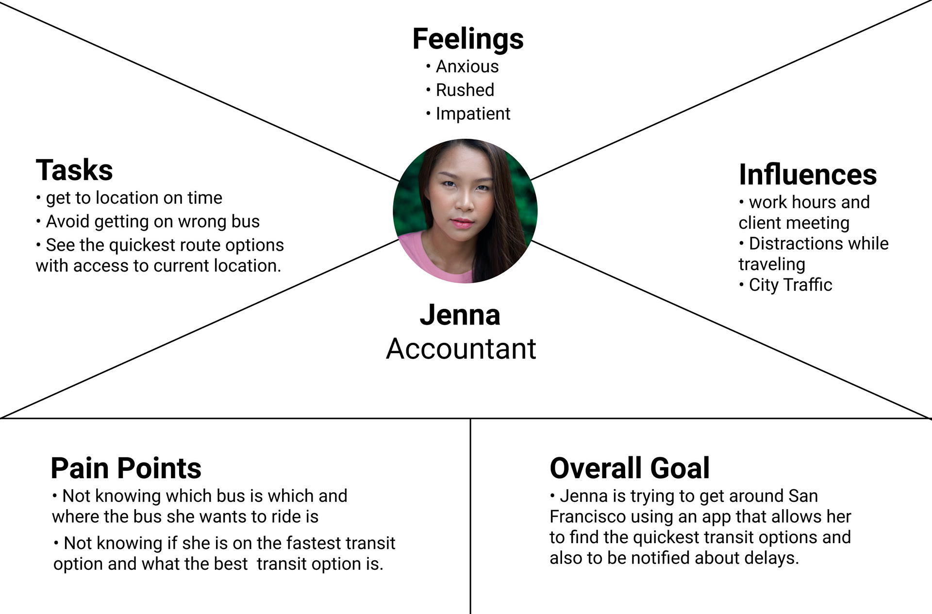
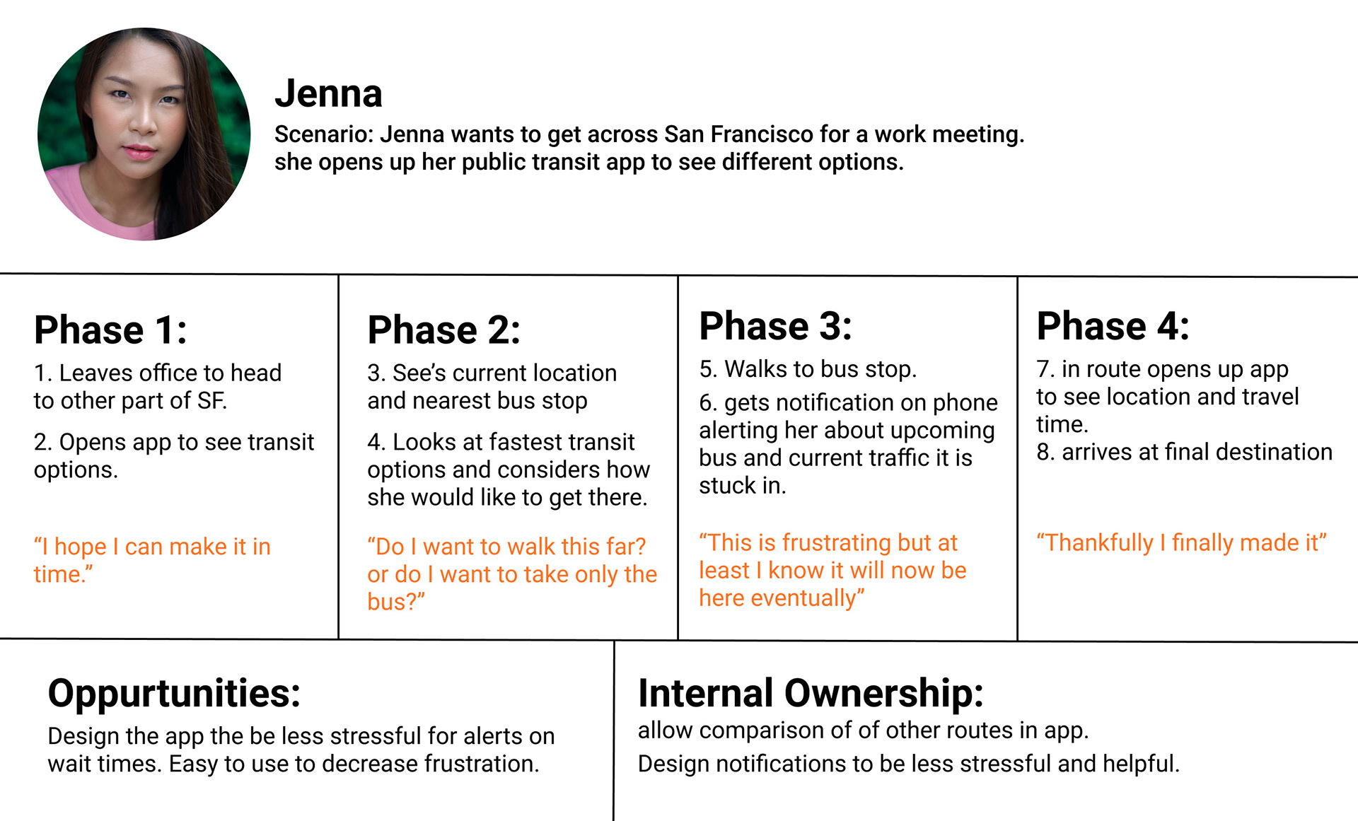
User Persona, Empathy Map, and Journey Map
After the interviews and surveys I analyzed the data and created a user persona on the typical rider. I also created an empathy map which helped me peer in to common pain points and feelings the riders experience while taking public transportation. The journey map helped me empathize with the typical rider and understand the context in how they will use the app.
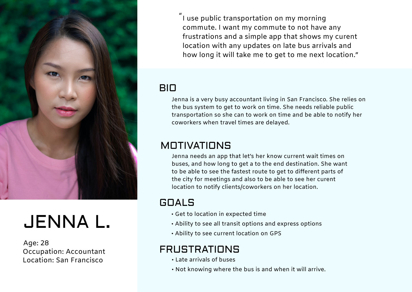
User Persona
Empathy Map
Journey Map
User Stories
I used data gather from interviews and surveys to outline typical user journeys users would take through the app. I rated them by importance while focusing on the minimum viable product. I ruled out going to the favorite location and paying in app for the transit because those were out of the projects scope.
Jenna - wants to see her bus schedule
- Unlocks phone and opens up BusNow
- Types in address
- Clicks bus schedule icon to open up schedule of buses
Importance: High
Jenna - wants to see where her bus is
- Types in address
- Selects certain bus on the schedule
- Bus is shown on GPS map with current location
Importance: High
Jenna - wants to know when to walk to stop
- Types in address
- Finds the stop she wants
- Selects bus arrivals schedule
- Updates on bus en route display with walking distance
Importance: Medium
Jenna - wants to pay in app for transit
- Types in address
- Finds the stop she wants
- Selects bus arrivals schedule
- Clicks the "pay" icon
- Uses credit card to pay for bus ride
Importance: Low
Jenna - wants to go to her favorite location
- Unlocks phone and opens up BusNow
- Selects favorite locations tab
- Taps on her favorite restaurant
- Opens up list of bus schedule
- Updates on bus en route display with walking distance
Importance: Low
User Flow and Sitemap
Created a typical user flow and a site map. This helped me ideate on different concepts and also helped lay the framework for the structure of the app.
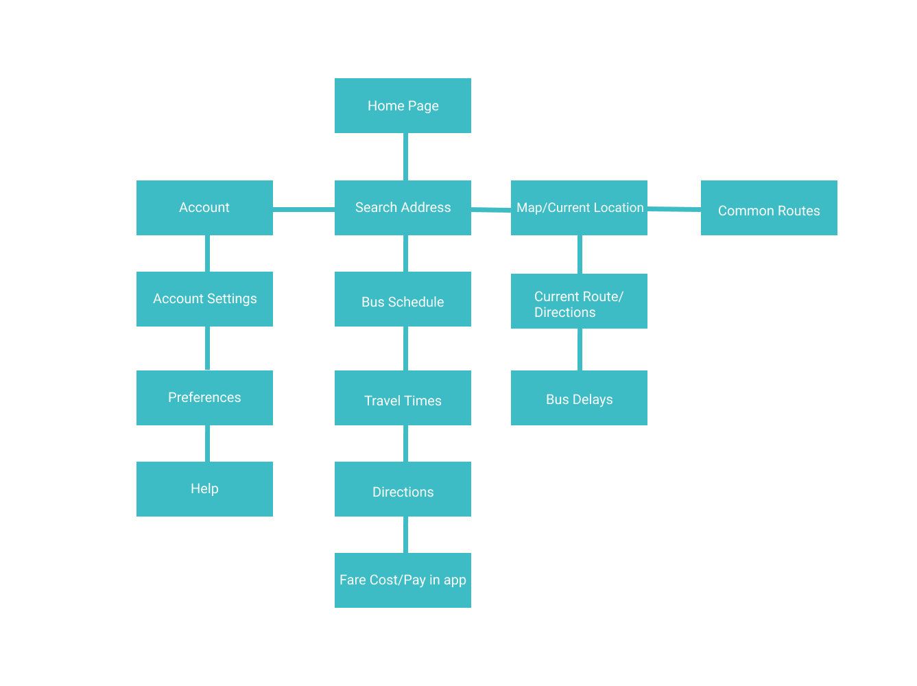
Sitemap
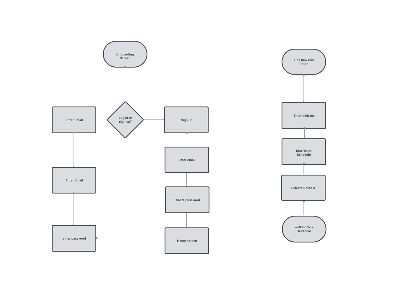
User Flows
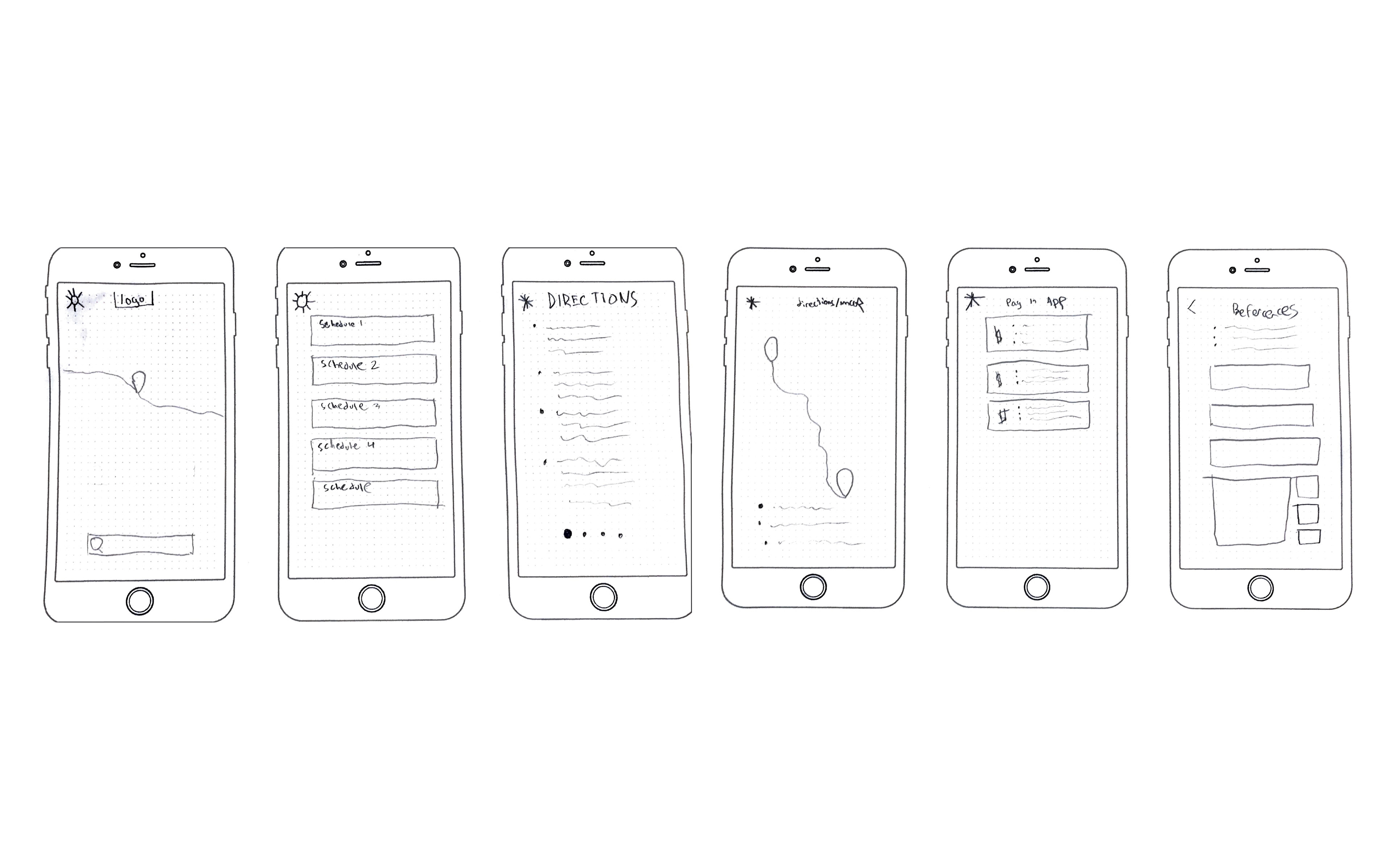
Sketched Wireframes
Sketched out wireframes to ideate on multiple concepts quickly, this allowed me to create ideas for information hierarchy and how the user could use the app.
Low Fidelity Digital Wireframes
After sketching out the wireframes I moved them to a digital space. I included a favorite locations tab and a pay in app feature in the initial wireframes but decided to take them out for the final product because they strayed too far from the MVP.
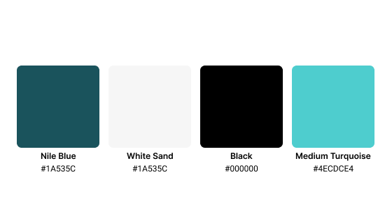
Branding
For the branding of the app I went with a minimal and clean color palette. I wanted the turquoise to guide users eyes to important features of the app. The logo uses inspiration of time as it resembles a clock and the wheel of a bus to convey motion.

First Round of Clickable Prototypes/Usability Testing
Created a list of tasks for the users to execute and watched closely to see how they would navigate through the app and to discover any usability issues. The tasks were:
1. search for a bus stop and a bus to get updates on arrival time, etc.
2. find the account settings on the app.
3. Change the selected bus to a different bus.
After the usability testing I noticed some key issues. One of the first, biggest issues was accessibility. The white text on top of the bright green was difficult to read and also distracting from the rest of the app. During testing I also noticed it took participants awhile to find the search bar because it was located at the bottom of the screen, I changed this to have the search bar clearly identifiable at the top of the screen. Another usability issue was the difficulty of finding different bus options because it was a swipe left to right feature, I changed this so it was a list view making it easier to see all the buses arriving at the stop. Another accessibility issue participants faced was small button sizes. I redesigned the buttons so the user could select whole the card of the bus arriving at the stop.
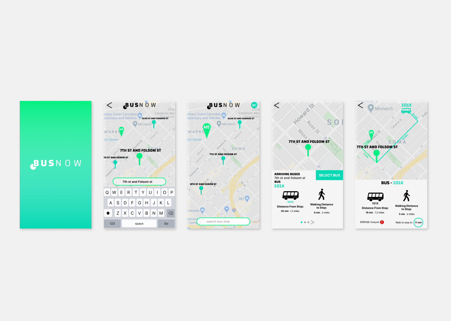
Version 1
Version 2
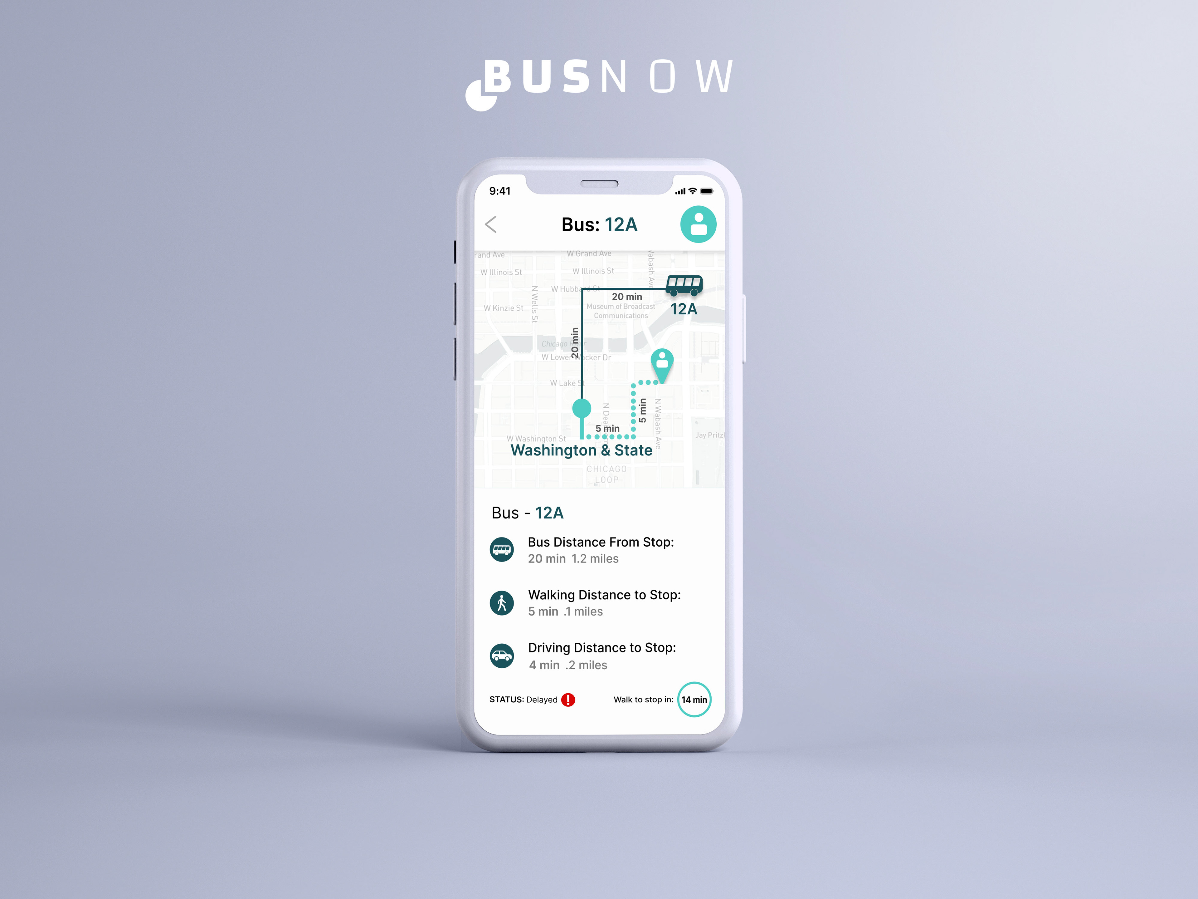
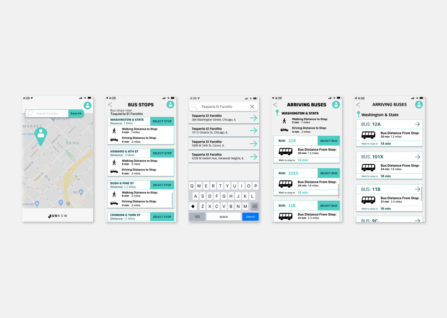
Final High Fidelity Clickable Prototype
After multiple rounds of usability testing I created a high fidelity clickable prototype that was functional and accessible. I reduced the large icon size and got rid of the distracting dark grey background to increase accessibility. I purposely made it clear that users can see how far away the bus is and the correct time to walk to the stop to get there in time. After users select the bus they can get live en-route updates on whether or not the bus is delayed and they can also see the buses location live on the map as well as there location.