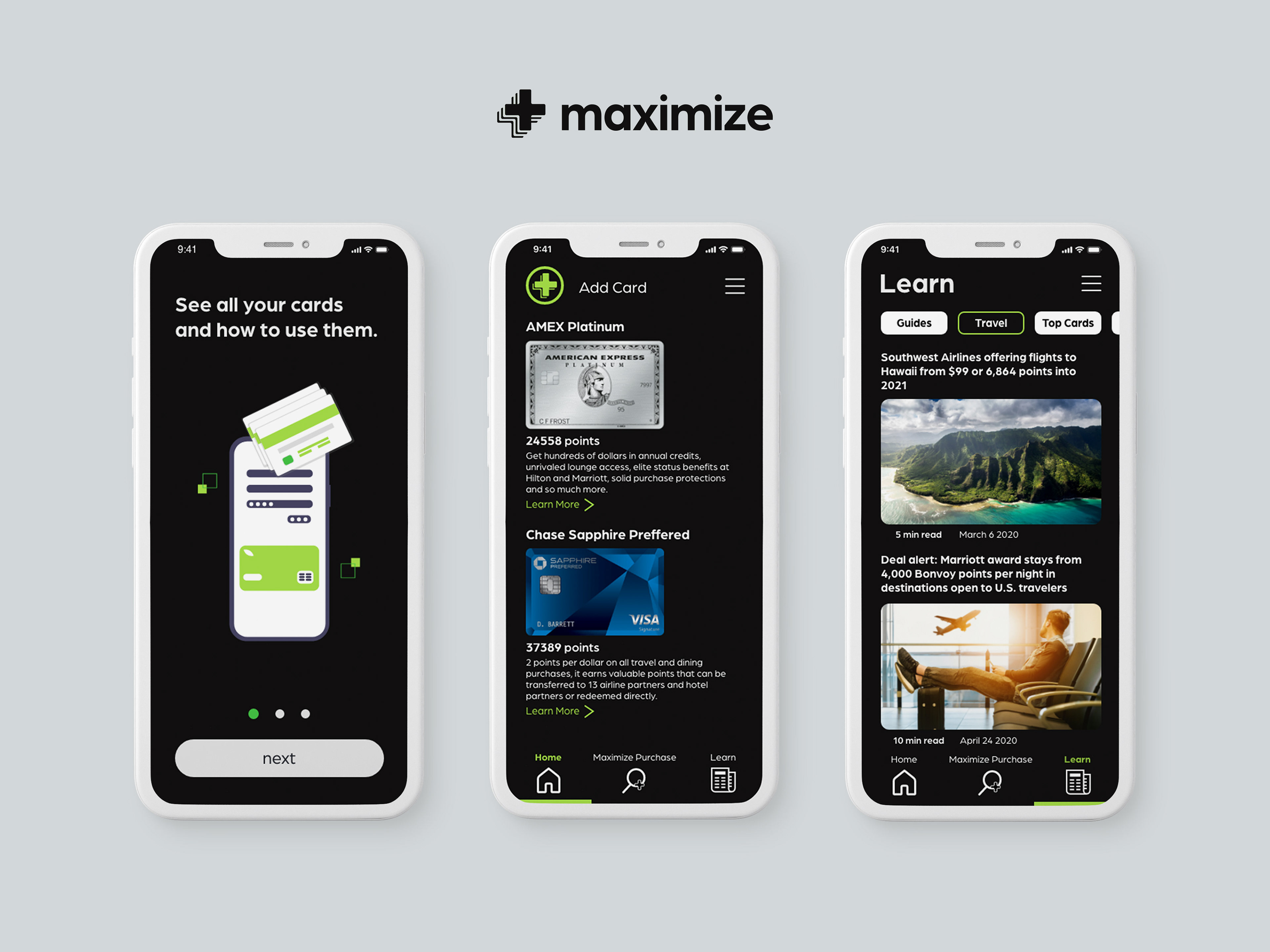
Maximize
Problem: With so much overwhelming information about points, miles, and credit cards. Many credit card users don't understand how to use their points, where to use them, and benefits these cards offer.
Solution: Maximize was created to help users understand where and when to use their card before they spend money, gain more knowledge about the cards they already own and receive news about points and miles.
Role: UX research, wireframes, user testing, branding, and high fidelity prototypes.
Tools: Adobe XD, Adobe Illustrator, and FlowMapp
Client Interview
In my interview with the client I discovered pain points that card users frequently experience. Most people have cards with so many features and benefits they don't understand how to maximize the value of the cards according to their spending habits. After the interview I noted some of the most important features the client discussed which were: understanding what card to use at a certain location, how to travel using points and miles, and a news feed about points and miles. I also learned more about the target audience and their goals in the interview.
UX Requirements
Why: Business Requirements
Inform users how to use specific cards for different purposes. The organization will make money from credit card sign-ups that users will be suggested to use in the app.
Who: User Requirements
The user needs to be able to identify how to maximize the value of their credit cards. The credit card experience needs to be more rewarding and valuable for the user.
What: Functional Requirements
Create a location based function where users will know what card to use in a certain location.
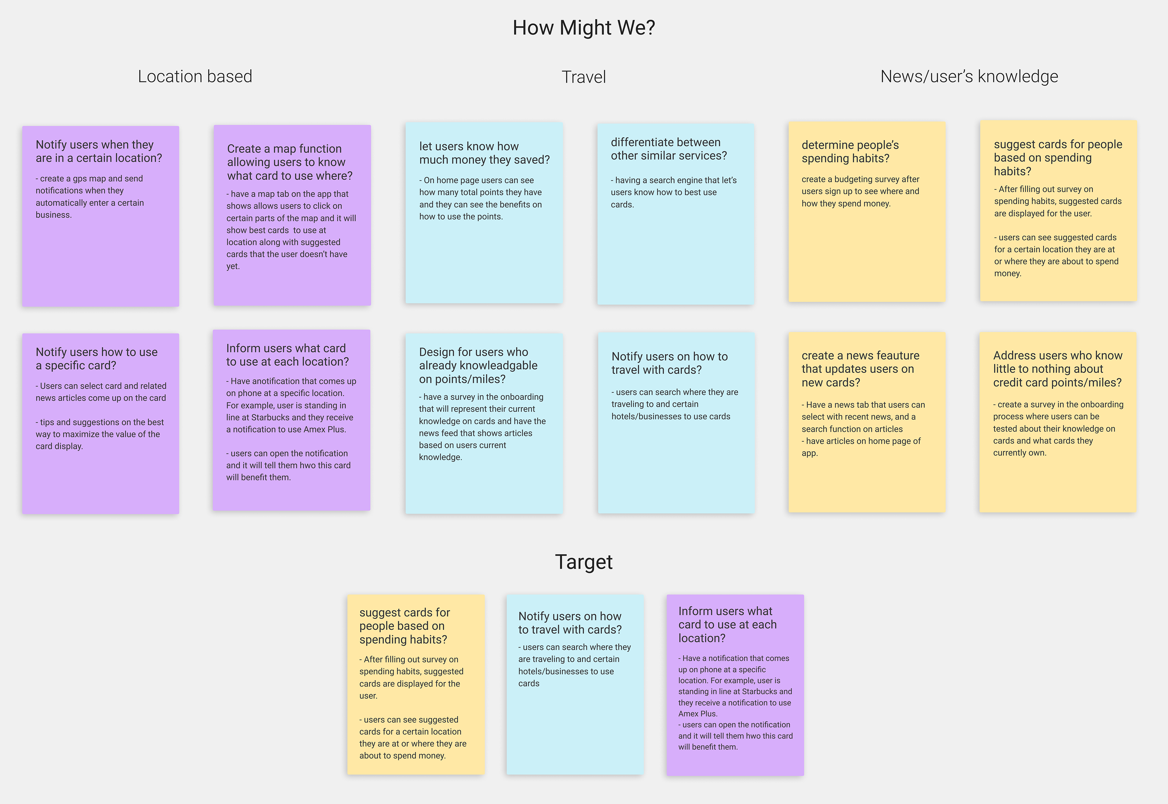
How Might We Method
I used the "How Might We?" method to ideate on multiple ideas. In this method I frame problems in to questions, for example, how might we inform users what card to use each location? After the brainstorming session I organized my notes in to different sections that are related: location based problems, travel problems, and how to address new users and provide them with basic information. After organizing them into different sections I targeted them down to the three most important problems to focus on. After the How Might We method I asked how might we fail? This helped me focus on problems to avoid while designing the app.

Competitive Analysis
For my competitive analysis I examined three different apps: KeyRing, AwardWallet, and NerdWallet. I completed a SWOT analysis and sitemap of all three apps. This gave me inspiration in to how they structured the app, what features they included, and the overall information hierarchy of the app.

Key Ring
Strengths
- Easy and intuitive add card function.
- Ability to add "lists" to see where coupons and deals can be found for certain items.
- Function to discover nearby deals related to your interests.
Weaknesses
- Bland color scheme with lack of hierarchy.
- Certain buttons are cluttered together making them difficult to select.
- Too many advertisement popups ruining the user experience.
AwardWallet
Strengths
- Merchant lookup tool allows the user to see which card to use to maximize points.
- Reverse lookup tool displays what merchant to choose with a specific card.
- Trip management feature shows the user best cards to use during different parts of travel.
Weaknesses
- card lookup tool was hidden within the app and needed to be more prominent.
- Difficult to use and understand for beginners to points and miles.- No guides or articles for more advice on credit card miles.
NerdWallet
Strengths
- Tips, news, and Guides for credit cards.
- "Optimize" feature allows you to see highest earning cards and general benefits of each card you own.
- Compare card function allows to easily compare cards side by side for pros and cons.
Weaknesses
- Too many features and generally overwhelming.
- Difficult to access more information on the card the users owned.
- No ability to look up cards before a certain purchase.
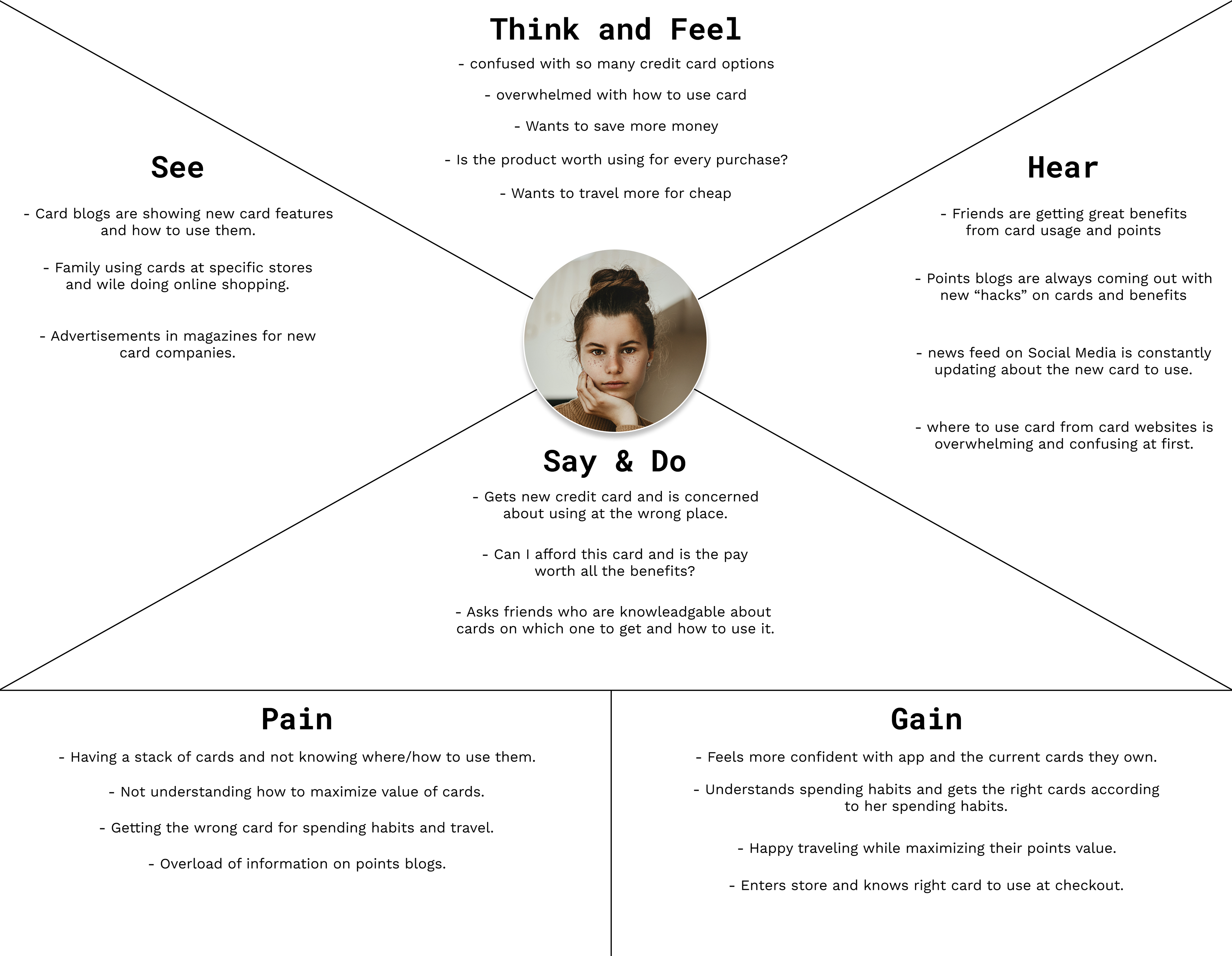
Empathy Map & Journey Map
I created an empathy map and Journey map to always keep the target user in mind. The typical user has so many credit cards they are stressed out and don't know how to maximize the value of the cards. They are typically overwhelmed with how much information there is on points blogs and just want to simply know how to best use their card. The journey map was created to see the context in how the typical user would use the app. The typical user is usually in a rushed setting like a checkout process where she wants to know what card to use to maximize the value of her card with points. I intended to make this process as simple as possible by making the buttons larger and decreasing the amount of steps to finish the steps.
Empathy Map

Journey Map
User Stories
Created user stories to help me ideate on most important actions the users would take in the app. I included features that would solve the user's frustrations and rated them by importance.
Leslie - wants to know what to card to use before purchase
- Unlocks phone and opens up Maximize
- Clicks the Maximize tab
- Enters her purchase
- App calculates best card to use for purchase
Importance: High
Leslie - wants to learn more about points
- Unlocks phone and opens up Maximize
- Clicks News tab
- Find’s article about a beginners guide to points
- Opens article to learn more.
Importance: High
Leslie - wants to see plan a vacation using just points
- Unlocks phone and opens up Maximize
- Taps on the travel section
- Inputs destination and current location.
- Gets a guide on what hotels to use points at
and more information regarding traveling
with points.
Importance: Medium
Leslie - wants to input her budget and
see suggested cards
- Unlocks phone and opens up Maximize
- Enters all her budgeting information
- App suggests cards based on spending habits
Importance: Low
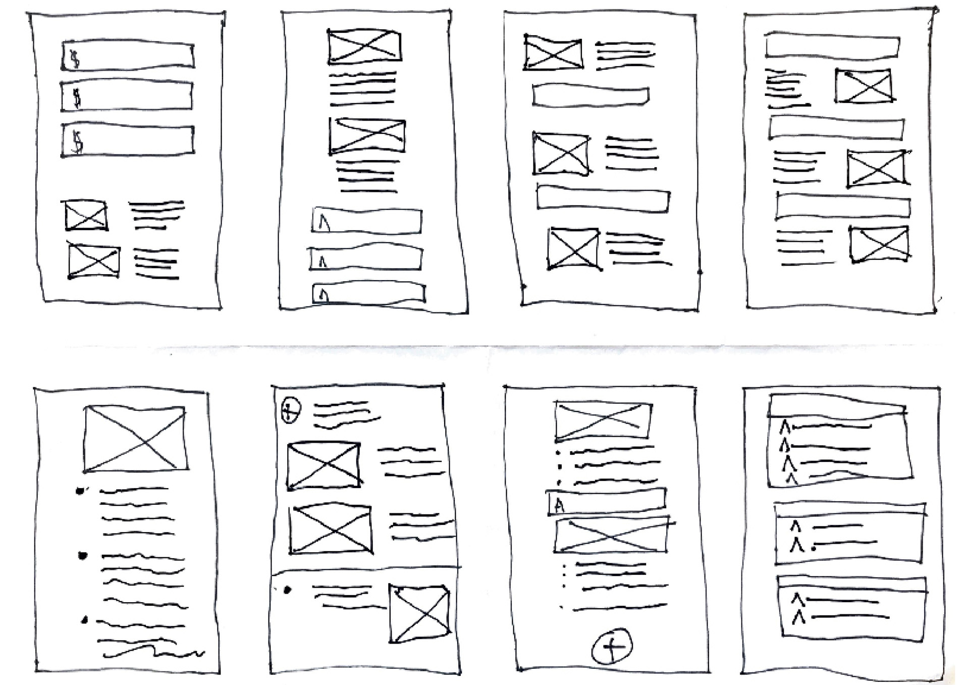
Sketches
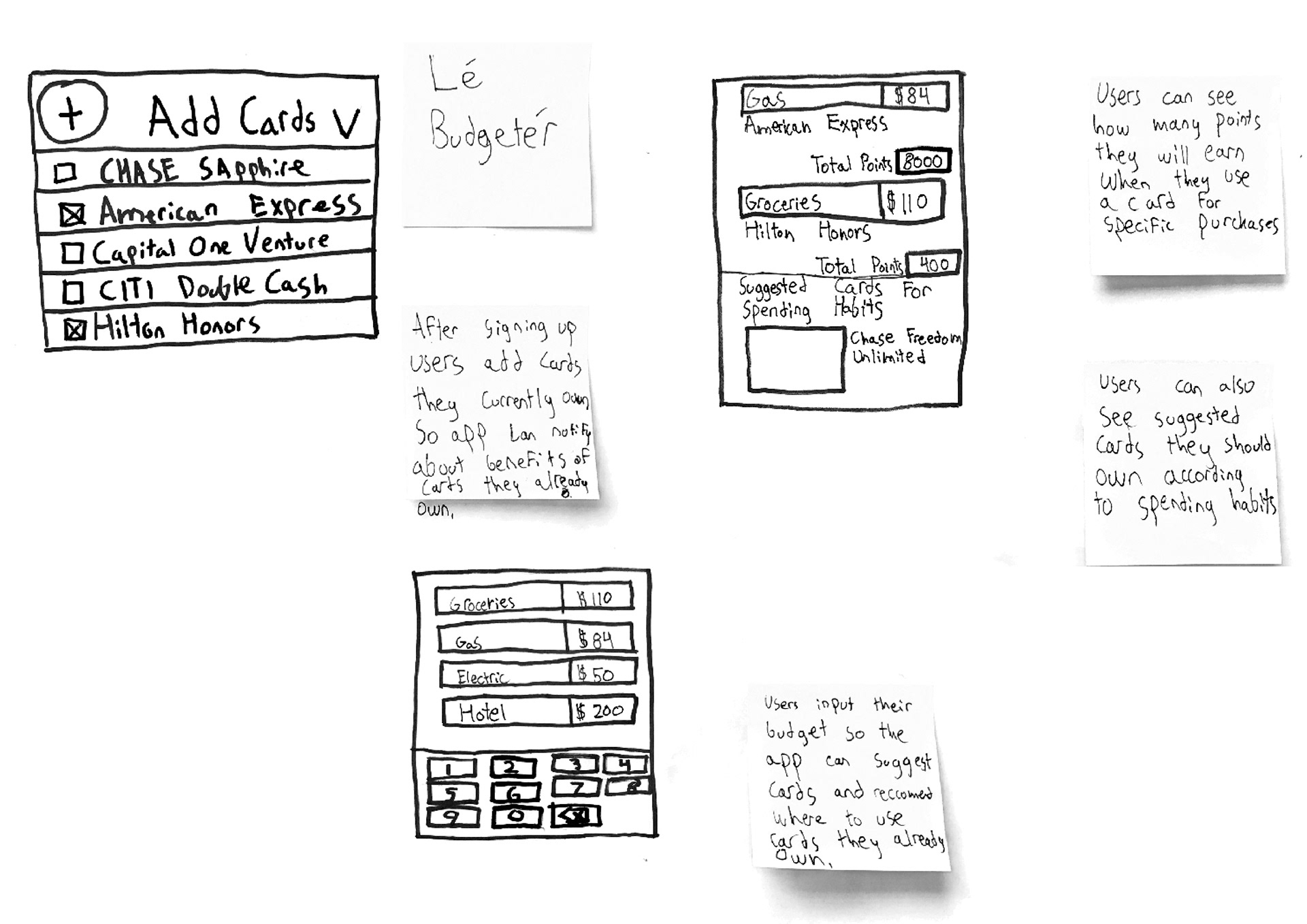
Using AJ & Smart's sketching technique I spent time writing notes about features to include, what features to leave out, and how to solve the main problems. I also used the crazy 8's technique, where I folded a paper into 8 sections. In each section I was only allowed to spend one minute sketching the layout of different features of the app. This assisted me in not spending time on just one concept and move quickly to other ideas. For the next phase of sketching I sketched an idea of users inputting their budget to see suggested cards according to their spending habits. They add how much they spend each week on average for typical things like groceries, gas, and entertainment. The app would then suggest cards that could give them the most value and points according to spending habits. This would create too much cognitive load for the users after they sign up so I decided to leave it out on the final product and focus on the MVP.
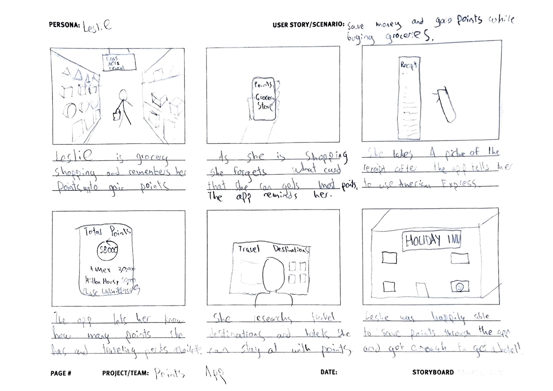
Storyboard
I then created a storyboard to go through the environment a user would use the app in. This helped me focus on the outside environment and features to include. For example, after the typical persona is shopping in a grocery store they can take a picture of their receipt and that would calculate how many points they earned after that the user looks at news section of the app and discovers what hotels she can stay at for free with her points.
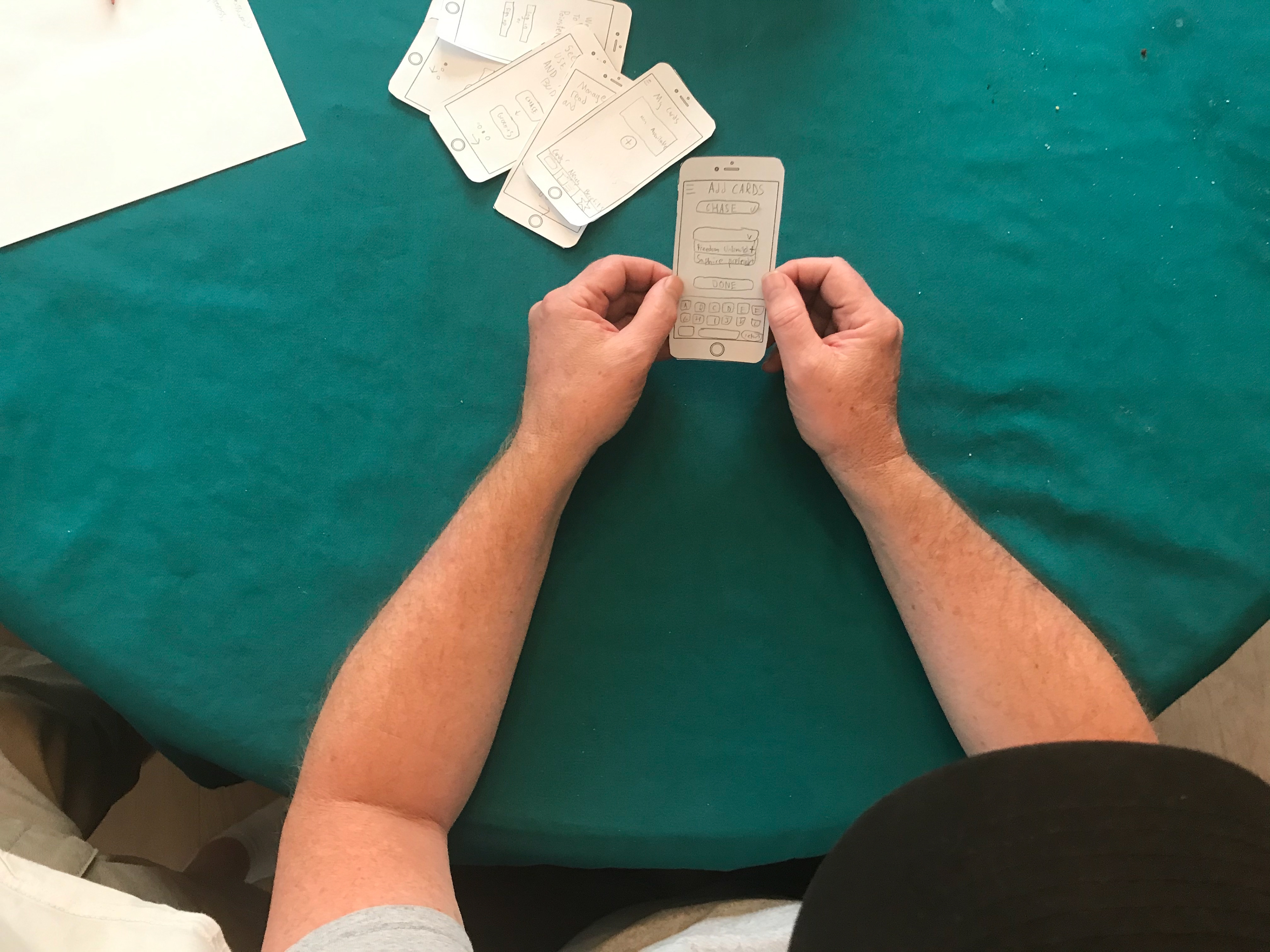
Paper Prototype Test
After the sketching phase I created a paper prototype and did rapid testing. I learned that creating a budget and entering the spending habits was too much of a cognitive load, the user simply wants to know what card to use to maximize their points.
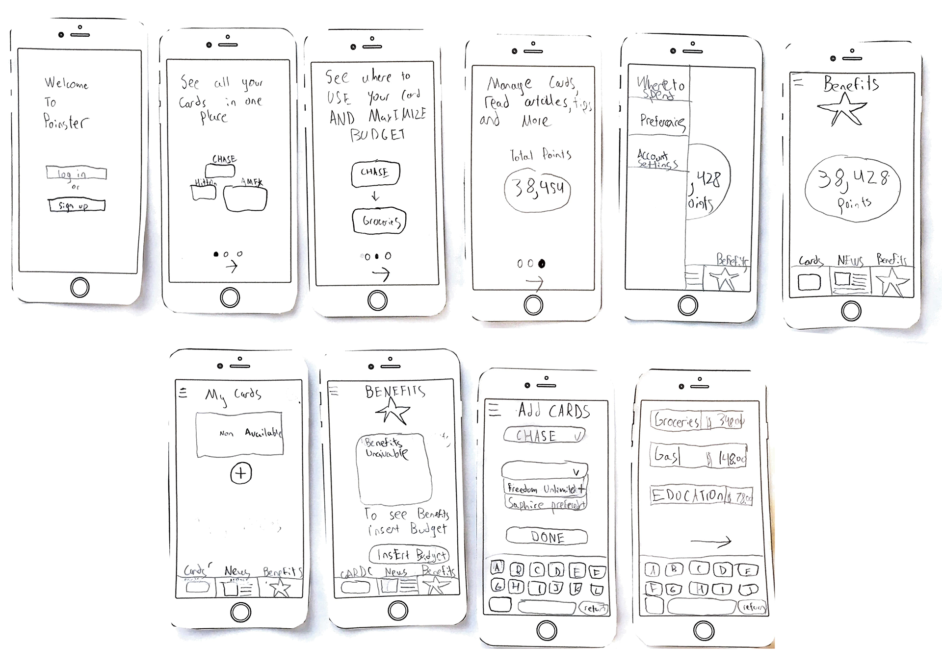
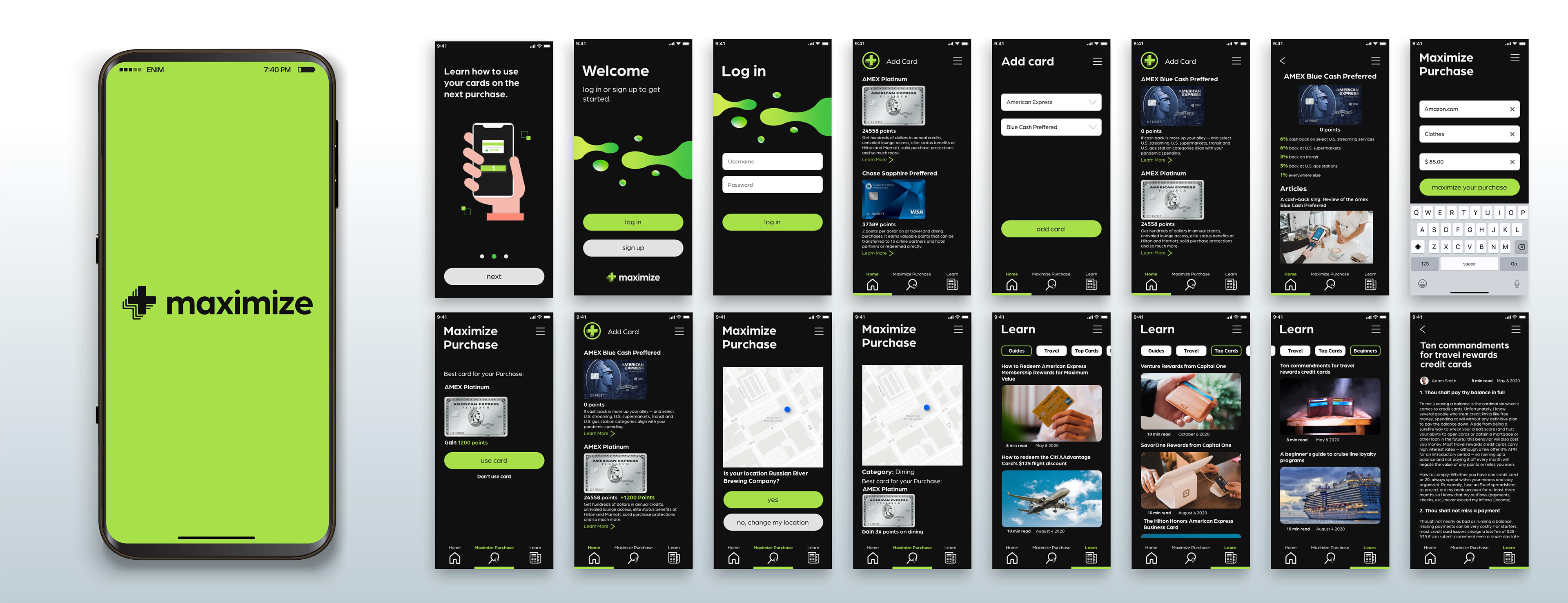
Digital Wireframes
After the sketching I created digital wireframes. These included the main features I wanted to include and outlined how the user would flow through the app.
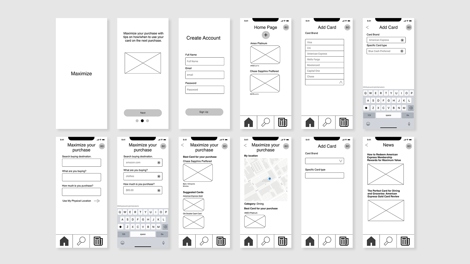
Clickable Prototype Version 1 & Usability Testing
I created the first clickable prototype after the wireframes. The tasks I had the user complete in the usability testing were: sign up for a new account, add a card to their account, see what card to use before their purchase while shopping online and at a store. The main issues I noticed were:
1. Participants were confused that they already cards in their account after they signed up. I changed this by having the user log in during the flow instead.
2. Participants had difficulty finding the add card feature. I moved the plus icon so it was left aligned and added the text "add card"
3. Participants were confused on finding the feature that allowed them to see what card to use before they make a purchase. The text "card lookup" was difficult to decipher so I changed it to "maximize purchase"
4. Participants were confused on not receiving feedback on certain aspects of the app. For example, I added a green bar to the bottom of the navigation icons so users would know where they are, I also added how many points they just gained after a recent purchase, and added a learn more feature so they could see the important aspects of their card after adding it to the app.
5. People new to points and miles wanted to know more about the basics rather than clicking the news tab and seeing a list of articles. I changed the title to "learn" and added different article categories to choose from including: guides, travel, top cards, and beginners.

High Fidelity Prototype
After the usability testing I made the appropriate changes to the app to increase usability and overall satisfaction with the app. Users can now easily add a card, learn more about their card and know which card is the best to use to maximize points.